
Sublimation color management addresses the chromaticity shifts that occur when disperse dyes transfer from screen to paper to substrate under heat. Colors appear different after pressing because the sublimation process alters how light interacts with embedded dyes compared to displayed pixels. Proper color calibration ensures consistency across monitors, printers, and final products by establishing predictable translation between RGB input and sublimation output throughout your entire workflow.
Key Takeaways
- ICC profiles control translation from RGB color space to sublimation output, ensuring consistent color reproduction across different devices and substrates.
- Delta E values below 2.0 indicate imperceptible color differences; values above 3.0 represent noticeable variation requiring adjustment.
- Proper color management can reduce color variation by up to 35%, eliminating guesswork and ensuring predictable sublimation results.
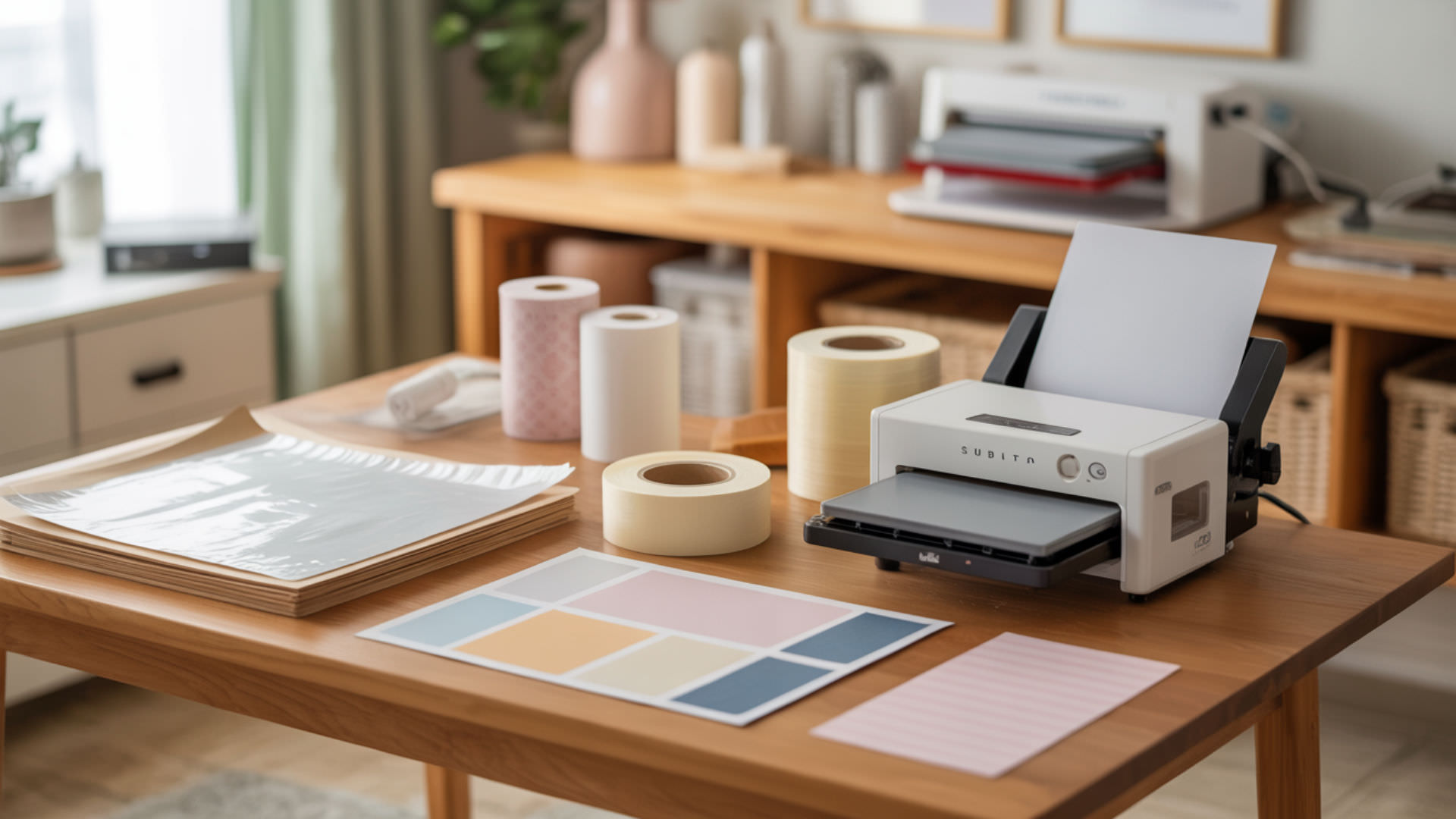
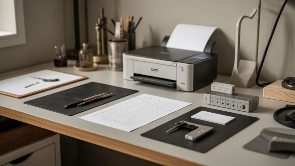
How Do You Use a Sublimation Color Chart Effectively?
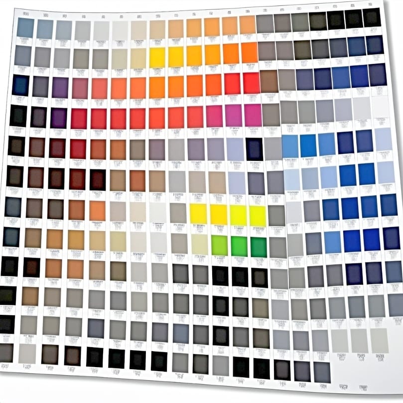
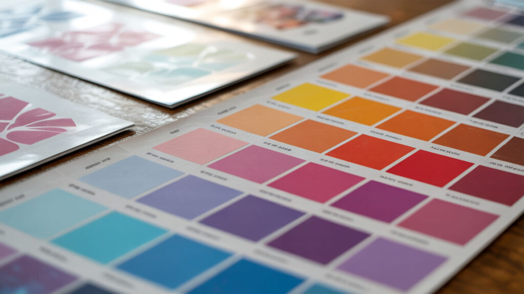
Color charts provide printed reference samples showing how specific RGB values appear after sublimation transfer onto your substrate. Evaluate charts under consistent viewing conditions—ideally D65 daylight illumination—because different light sources alter perceived color accuracy. Charts bridge the gap between screen display and physical output, revealing how your specific ink, paper, and substrate combination reproduces each hue. Color perception changes significantly depending on the light source, which is why standardized viewing conditions are essential when evaluating printed output. [1]
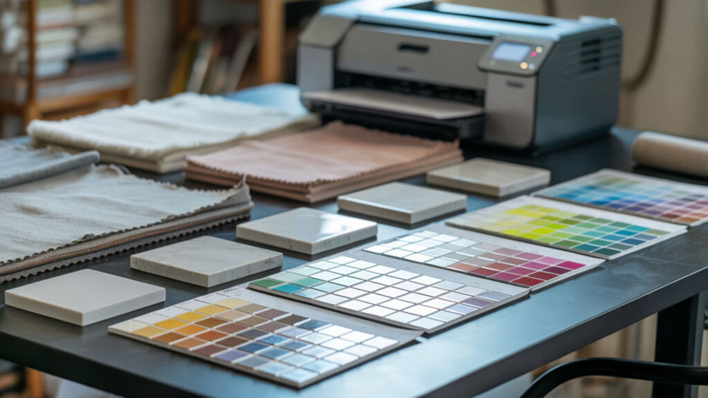
Creating Your Own Reference Charts
Print calibration targets using your ICC profile to evaluate device accuracy under controlled color space conditions. Include swatches covering primary colors, gradients, flesh tones, and neutral grays that reveal common problem areas. Press charts onto the same substrate you’ll use for production to capture accurate color behavior. Document RGB values beneath each swatch so you can reference specific formulations when designing future projects.
Understanding Color Shifts During Transfer
Chromatic adaptation occurs when your eye adjusts to different substrate white points—a bright white polyester versus an off-white coated surface produces different perceived color even with identical dye deposits. The substrate’s white point influences how all transferred colors appear. Understanding these shifts helps you compensate during design by adjusting source files to achieve target colors after the sublimation process alters their appearance.
Matching Digital Colors to Physical Results
Soft proofing displays an on-screen preview of how colors will appear after sublimation transfer, predicting output before committing ink and materials. Enable soft proofing in design software using your printer’s ICC profile for accurate simulation. Be aware of metamerism—colors that match under one light source may appear different under another. Evaluate physical samples under multiple lighting conditions to ensure consistent appearance across environments.
What Picture Quality Do You Need for Sublimation Success?

Image quality for sublimation depends on maintaining proper RGB color space and sufficient resolution throughout your workflow. RGB images serve as input for sublimation systems; the printer translates these values through ICC profiles into CMYK ink combinations. Resolution determines clarity and detail in final prints—insufficient resolution produces pixelation and soft edges that degrade professional appearance. Understanding resolution requirements for different products helps ensure sharp, detailed sublimation output, which our picture quality guide explains thoroughly.
⫸ Click Here For Best Selling Sublimation Printers And Products ⫷Resolution Requirements for Different Products
Standard sublimation requires a minimum 150 DPI for acceptable results, with 300 DPI considered ideal for photographic quality and fine detail. Continuous-tone printing enhances smooth gradients in photographs while dithering helps simulate missing colors in lower resolution images. Products viewed closely (mugs, phone cases) benefit from higher resolution; large format items (banners, flags) tolerate lower DPI because viewing distance increases.
File Formats and Compression Issues
File format affects color accuracy through gamma settings and tone reproduction curves that influence shadow and highlight rendering. PNG preserves quality with lossless compression and supports transparency; JPEG compression reduces file size but degrades color data with each save. TIFF with LZW compression works best for large format sublimation. Save working files in formats that maintain full color information until final output.
Scaling Images Without Quality Loss
Scaling raster images causes quality degradation as software interpolates new pixels between existing ones. XYZ color space maintains consistent color data during scaling operations by preserving colorimetric accuracy. Vector graphics resize without quality loss, making them ideal for logos and text elements. When enlarging raster images, maintain minimum 300 DPI at final output size—a chromaticity diagram helps visualize color limitations that scaling may introduce.
How Can You Make Sublimation Colors Appear Darker?
Achieving darker sublimation colors requires controlling print density—the amount of dye deposited during printing—and optimizing transfer conditions. Lightness (L*) in the LAB color space defines perceived brightness and depth; lower L* values produce a darker appearance. Multiple factors affect final darkness including ink saturation, substrate characteristics, and heat press parameters. Adjusting print density directly affects color depth, which is our guide on making sublimation darker covers with specific techniques.
Adjusting Print Density and Saturation
Increasing saturation directly affects the richness of darker colors by pushing hues toward maximum intensity. Excitation purity indicates saturation relative to spectral edge—higher purity produces more vivid results. Adjust print settings to deposit more ink for richer color; some RIP software allows density adjustments beyond standard driver limits. Balance density increases against substrate absorption capacity to avoid over-saturation and bleeding.
Paper and Substrate Considerations
Substrate white points affect perceived darkness—brighter whites create more contrast, making colors appear deeper. Color tolerance determines acceptable variation across production runs. Higher weight sublimation paper (120–150gsm) holds more ink without bleeding, enabling denser color deposits. Match paper weight to substrate requirements: lighter papers for rigid substrates, heavier papers for large format fabric applications.
Heat Press Settings for Deeper Colors
Dye sublimation transfers more completely at optimal temperature (180–205°C) and adequate dwell time, producing deeper color penetration. Thermal stability limits maximum temperature before color degradation occurs—exceeding this threshold causes dye damage and color shifting. Longer press times at the correct temperature increase dye diffusion depth without overheating. Monitor pressure consistency to ensure even color transfer across the entire substrate surface.
Is It Possible to Print Neon Colors with Sublimation?
True neon colors lie outside standard CMYK gamut on the spectral locus—the boundary of visible colors that conventional sublimation inks cannot reach. Achieving maximum saturation with standard inks produces bright results but not fluorescent glow. Specialized fluorescent sublimation inks expand available gamut to include neon hues, though they require compatible equipment and separate ink channels. Understanding how saturation limits affect neon output helps set realistic expectations, which our neon sublimation printing guide addresses in detail.
Understanding CMYK Limitations
The CIE 1931 color space defines standard device gamut limits—CMYK printing cannot reproduce colors outside this boundary. Neon colors reflect more visible light through fluorescence, a property CMYK inks lack. CIE 1976 UCS helps compare printable versus non-printable colors, showing where neons fall outside achievable range. RGB screens display colors CMYK cannot print, creating inevitable mismatch between design preview and physical output.
Achieving Bright and Vibrant Effects
Dominant wavelength influences perceived neon-like appearance—colors at spectral extremes appear more vivid. Maximize chromaticity within achievable gamut by pushing saturation to limits without clipping. Soft proof designs in CMYK mode before printing to preview actual output. While standard sublimation cannot achieve true fluorescence, proper color management produces the brightest possible results within CMYK constraints.
Working with Fluorescent Substrates
Fluorescent substrates provide neon base colors that sublimation dyes modify rather than replace. A protective overcoat helps maintain vibrancy and brightness after transfer. When using printers with fluorescent ink ribbon panels, dye saturation affects how colors interact with the substrate’s inherent fluorescence. This approach produces genuine neon effects by combining fluorescent materials with sublimation’s permanent dye bonding.
Why Are Test Prints Essential for Color Management?

Test prints reveal actual output before committing to production runs, measuring deviation using Delta E calculations. Color tolerance defines acceptable differences—typically Delta E below 3.0 for commercial work. Testing catches problems early: ICC profile mismatches, ink issues, substrate incompatibility, and press calibration drift that would ruin entire batches. Using Delta E measurements ensures objective evaluation of color accuracy, which our test print guide covers with practical workflows. Color accuracy is evaluated objectively using standardized color-difference metrics such as Delta E, which quantify perceptible variation between samples. [2]
Creating a Testing Workflow
Establish color matching protocols that ensure predictable print behavior across production. Use calibration targets providing repeatable reference points for evaluation. Test on actual production substrates—results vary between materials. Build testing into standard procedures: nozzle checks before printing, color swatches with each batch, and periodic full calibration verification to maintain consistency over time.
Documenting Results for Consistency
Device profiles enable consistent reproduction across multiple print sessions by storing calibration data. Record settings, measurements, and visual evaluations for each substrate and project type. CIEDE2000 provides the most accurate metric for comparing printed samples against targets. Documentation allows troubleshooting when results drift and helps train new operators to achieve consistent quality standards.
Cost-Effective Testing Methods
Evaluate test prints under Illuminant D65 standard daylight conditions to eliminate lighting variables affecting judgment. Maintain consistent viewing conditions—same light source, viewing angle, and background—for all color evaluations. Use small test swatches before full transfers to conserve materials. Print multiple test targets on single sheets to maximize efficiency while verifying color accuracy across different design elements.
Which Tools Help You Achieve Better Color and Quality?
Professional color management requires measurement instruments that quantify accuracy objectively. Colorimeters measure display color accuracy before printing, ensuring your monitor shows true colors during design. Spectrophotometers measure printed output for ICC profile creation and quality verification after transfer. Together, these tools establish a calibrated workflow from screen to substrate. Investing in a colorimeter and related calibration hardware improves results significantly, which our sublimation tools guide reviews with specific recommendations.
Color Calibration Hardware and Software
Color calibration synchronizes all devices in your workflow—monitor, printer, and measurement tools—for accurate reproduction. Gamma settings impact tonal distribution throughout the image, affecting shadow and highlight appearance. Software like X-Rite i1Profiler creates custom profiles matching your specific equipment combination. Regular recalibration maintains accuracy as components age and environmental conditions change.
ICC Profiles and Their Importance
ICC profiles control color conversion paths between devices, translating RGB screen values to CMYK printer output accurately. Device profiles support correct mapping for each specific printer, ink, and paper combination. Generic profiles produce acceptable results; custom profiles optimized for your exact setup achieve professional accuracy. Install profiles correctly in your operating system and configure design software to use them during printing.
Quality Control Equipment
CIE76 provides basic distance metrics for quick color difference calculations during production. CIE94 offers improved accuracy with textile-appropriate weighting factors for fabric sublimation. CIEDE2000 represents the current industry standard for precise color evaluation. Spectrophotometers like the X-Rite i1Pro measure actual printed output, enabling objective quality control rather than subjective visual assessment alone.
Final Thoughts
Effective sublimation color management requires consistent color calibration across your entire workflow—from monitor display through printer output to final pressed product. ICC profiles provide the foundation for predictable results by controlling how colors translate between devices. Invest time in proper calibration, regular testing, and documentation to achieve professional-quality sublimation with accurate, repeatable color reproduction on every project.
Frequently Asked Questions
Why don’t my sublimation colors match what I see on my computer screen?
Screen-to-print mismatch occurs due to metamerism—monitors display RGB light while prints reflect CMYK ink under ambient lighting. Uncalibrated monitors show inaccurate colors, and missing or incorrect ICC profiles cause translation errors during printing. Soft proofing helps predict output but cannot perfectly simulate physical results. Calibrate your monitor regularly, use correct profiles, and always verify with test prints before production runs.
Can I achieve true black with sublimation printing?
Sublimation produces rich black by combining maximum CMYK values, but achieving true neutral black requires careful chromatic adaptation for your specific substrate’s white point. Some blacks appear warm or cool depending on ink ratios and substrate color. Create dedicated black swatches during testing to find the combination producing neutral appearance on your materials. Rich black (adding CMY to K) produces deeper results than K-only black.
How often should I recalibrate my color settings?
Recalibrate monitors monthly for consistent display accuracy—more frequently in professional environments. Reprinter profiles when changing ink brands, paper types, or after significant equipment maintenance. Environmental changes (temperature, humidity) affect both monitors and printers. Establish regular calibration schedules: weekly nozzle checks, monthly monitor calibration, quarterly full system verification including printed test targets measured against standards.
What causes color banding in sublimation prints?
Banding appears as visible stripes in gradients, typically caused by clogged printhead nozzles, low resolution settings, or insufficient ink density. Run nozzle checks before printing; clean heads when gaps appear in test patterns. Increase print resolution to improve gradient smoothness. File compression can introduce banding in source images—use lossless formats for designs with subtle gradients. Proper dithering settings help smooth transitions between colors.
Is it worth investing in a color calibration tool for sublimation?
Professional color calibration tools provide measurable return on investment through reduced waste, fewer reprints, and consistent customer satisfaction. Entry-level colorimeters start around $150 and dramatically improve monitor accuracy. Spectrophotometers for print measurement cost more but enable custom ICC profile creation. For commercial sublimation operations, calibration tools pay for themselves quickly by eliminating guesswork and ensuring predictable results.
References
- Museums & collections (U.S. National Park Service). (2024, December 10). NPS.gov (U.S. National Park Service). https://www.nps.gov/subjects/museums/index.htm
- Chapter 10: Color and appearance. (2017, March 27). NIST. https://www.nist.gov/publications/chapter-10-color-and-appearance